Read the manual

Everything you need
to ship responsively.

Installation, configuration, every control, and the developer API — in one place.

Installation

From WordPress.org

The Free plugin is not listed on WordPress.org yet. Once it is, installation is Plugins → Add New → search for "FluidBlocks" → Install Now → Activate.

Upload ZIP

  1. Download the plugin .zip from WordPress.org once the plugin is listed there. The Pro add-on's .zip comes from your account after purchase.
  2. Go to Plugins → Add New → Upload Plugin.
  3. Choose the file and click Install Now.

Manual

Upload the plugin folder to /wp-content/plugins/fluidblocks/ and activate it through the Plugins screen.

Requirements: WordPress 6.9 or newer (tested up to 7.1) and PHP 8.0 or newer.

First Steps

After activating the plugin, head to Settings → FluidBlocks. This is where you configure which blocks and features are enabled.

  1. Enable blocks — toggle on the core blocks you want responsive controls for (e.g. Group, Columns, Heading).
  2. Choose features — for each block, pick which controls to activate (visibility, padding, margin, etc.).
  3. Open the editor — select any enabled block; a responsive toolbar button appears in the block toolbar.
  4. Use the popover — click the toolbar button to open a popover with breakpoint tabs at the top. Switch between Mobile, Tablet, Desktop, and XL to set values per breakpoint.
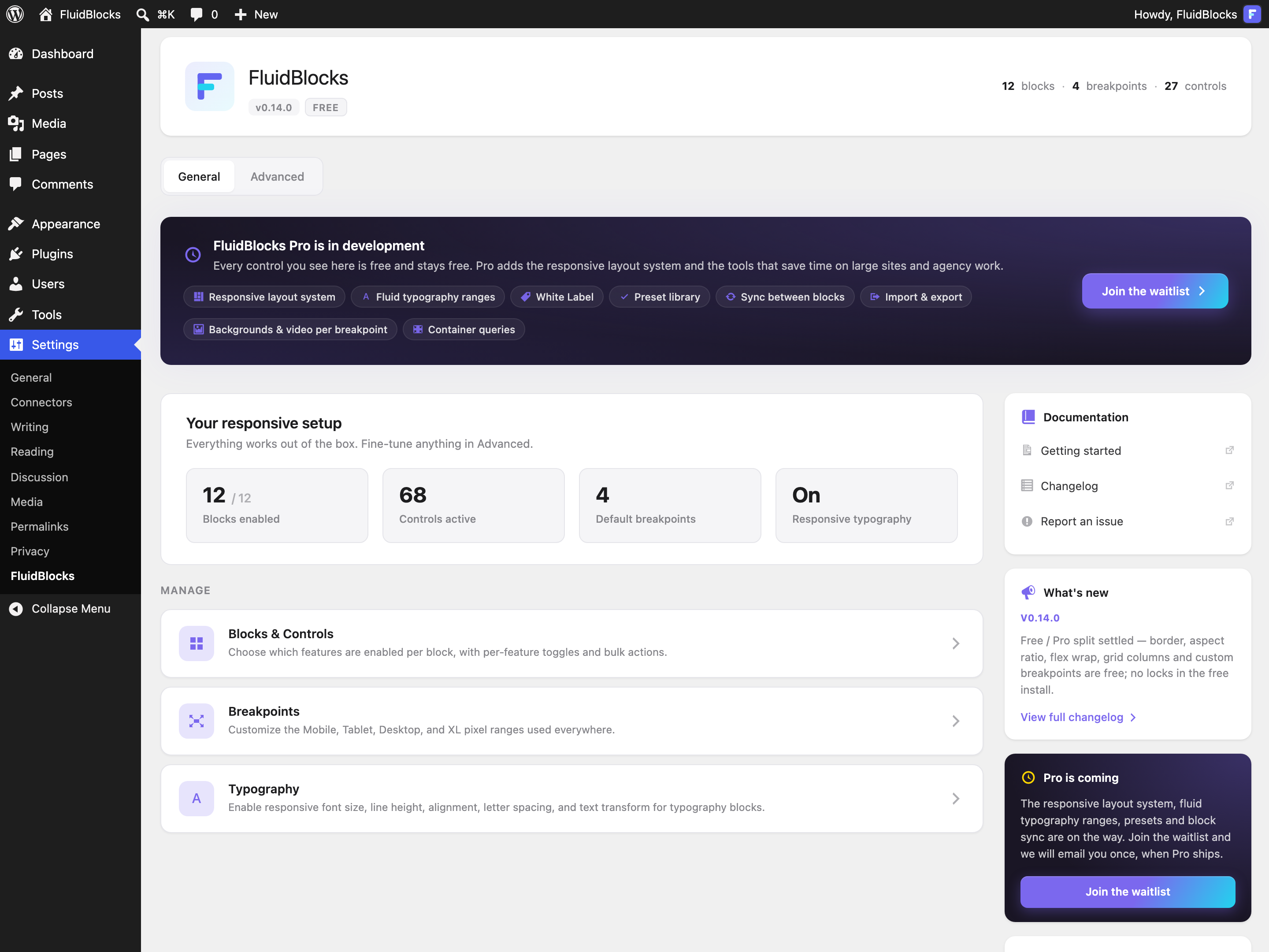
The FluidBlocks settings screen in wp-admin: setup summary cards and the Blocks & Controls, Breakpoints and Typography management sections
Settings → FluidBlocks — blocks, controls, breakpoints and typography in one place.
Tip: Toggle Enable inside the popover to activate responsive controls for a specific block instance. Until it is on, the controls stay disabled and the block renders exactly as core would.

The plugin works in both the post/page editor and the Site Editor (FSE) — the experience is identical.

Upgrading to Pro

The free plugin is the complete responsive baseline: visibility, padding, margin, block spacing, width, image height and aspect ratio, minimum height, spacer height, borders, justification, vertical alignment, flex wrap, grid columns, typography (font size, line height, alignment, letter spacing, text transform), custom breakpoint values, copy & paste of responsive settings and the developer API. Pro controls simply do not appear in a free install: there are no locked controls in the editor.

Pro adds the responsive layout system — flex-child width and height, grid column and row span, order, content and wide width, grid min. column width — plus fluid clamp() typography and White Label. Presets, block sync, JSON import/export and per-breakpoint backgrounds are on the Pro roadmap.

Pro is launching soon. Join the waitlist for the early-bird discount and one email when it ships.

When Pro is released, you'll install the Pro addon alongside the free plugin and activate your license under Settings → FluidBlocks → License. The Pro addon requires the free plugin to be installed and active.

Default Breakpoints

The plugin ships with four breakpoint ranges:

BreakpointRange
Mobile0 – 767px
Tablet768 – 1024px
Desktop1025 – 1440px
Extra Large (XL)1441px+

Responsive CSS is generated using @media queries matching these ranges. Each breakpoint tab in the editor popover corresponds to one range.

Custom Breakpoints

Adjust the breakpoint pixel values under Settings → FluidBlocks → Advanced → Breakpoints to match your theme or design system.

  • Change the pixel threshold for each breakpoint boundary.
  • The plugin validates that values are in ascending order — Mobile < Tablet < Desktop < XL.
  • Changes apply immediately to both the editor preview and the frontend output.

Included in the free version.

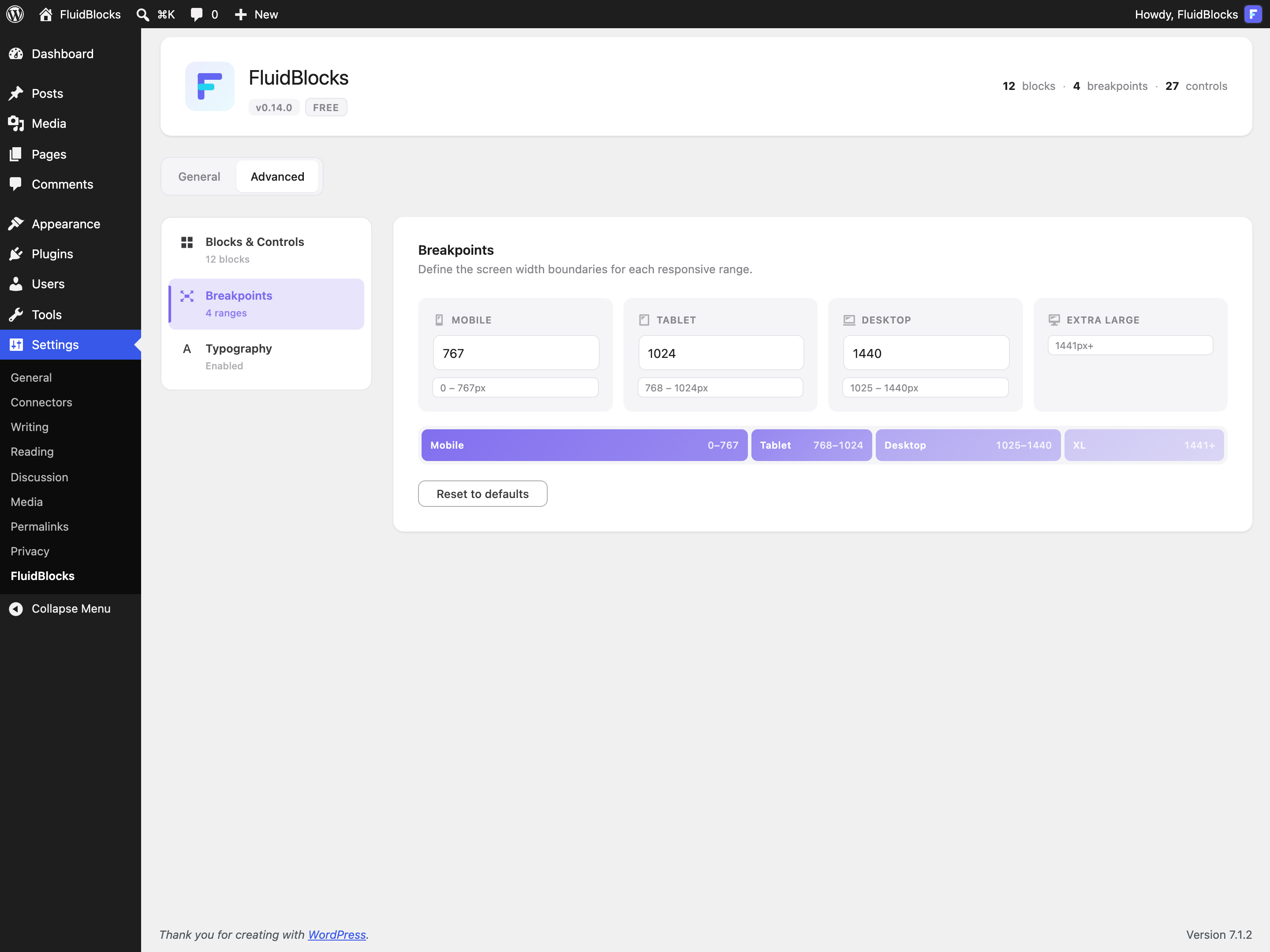
The Breakpoints screen: editable pixel boundaries for Mobile, Tablet, Desktop and Extra Large, with a bar visualising the resulting ranges
Advanced → Breakpoints — set the boundaries once, every control follows them.

Visibility

Hide any supported block on specific breakpoints. Use the Hide on this breakpoint toggle inside the responsive popover.

When a block is hidden on a breakpoint, it gets display: none !important inside the corresponding media query. The block is still present in the HTML — it's simply not visible.

Visibility is the one setting that never cascades: hiding a block on Mobile does not hide it on Tablet or above. To drop a block from the published page on every screen, use Omit from published content in the same popover (or Ctrl+Shift+H) — the block stays in the editor but is not rendered on the frontend.

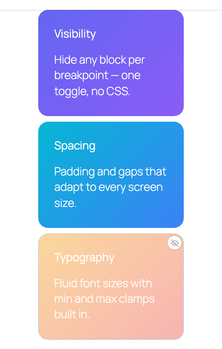
The editor canvas in mobile preview: two cards at full opacity and a third card soft-dimmed with a crossed-eye badge, marking it as hidden on this breakpoint
In the editor, hidden blocks soft-dim instead of disappearing — you can still select and edit them.
Use cases: mobile-only CTAs, desktop-only sidebars, tablet-specific hero layouts, or hiding decorative spacers on small screens.

Available for all 12 supported blocks. Included in the free version.

Padding

Set inner spacing per breakpoint using the native WordPress spacing size control. You can configure top, right, bottom, and left padding independently.

Responsive padding replaces the block's native padding rather than layering on top of it: enabling responsive controls removes the native value in the editor, and on the frontend any native inline padding is stripped whenever a responsive padding is set on any breakpoint. Below the first breakpoint that has a value, the block has no padding of its own and the theme default applies.

Supported blocks: every supported block except Spacer — Group, Columns, Column, Heading, Paragraph, Image, Cover, Buttons, Button, List, Media & Text.

Included in the free version.

Margin

Control outer spacing per breakpoint on all four sides (top, right, bottom, left). Works the same way as padding — uses the native spacing size control and overrides the block's native margin within the corresponding media query.

Supported blocks: every supported block except Column — Group, Columns, Spacer, Heading, Paragraph, Image, Cover, Buttons, Button, List, Media & Text. On a Spacer, margin and height are the two spacing controls available.

Included in the free version.

Block Spacing (Gap)

Control the gap between child blocks per breakpoint. Sets both row-gap and column-gap.

Useful for tighter spacing on mobile and generous gaps on desktop — especially in Columns, Group, and Buttons blocks.

Supported blocks: Group, Columns, Column, Cover, Buttons, Media & Text.

Spacer Height

Set a custom height for the Spacer block per breakpoint. Less vertical space on mobile, more breathing room on desktop — without duplicating the block.

When responsive height is active, the value overrides the spacer's default height inside the corresponding media query. The native height field stays as the fallback for any breakpoint you don't explicitly override.

Supported on the core/spacer block.

Width

Set an exact width per breakpoint — a full-width column on mobile, a 30% sidebar on desktop. Accepts any CSS length (px, %, rem, vw) or one of the theme's dimension presets.

Supported blocks: Column, Image, Button.

Included in the free version.

Image Height & Aspect Ratio

Two per-breakpoint controls for the Image block, in the Dimensions area of the responsive popover:

  • Height — a fixed height (any CSS length or a theme dimension preset). The image is cropped with object-fit: cover rather than stretched, exactly like core's own height control.
  • Aspect ratio — square on mobile, 16:9 on desktop. Applied to the image itself, independent of the Resolution setting.

When both are set on the same breakpoint the browser resolves them natively: the explicit height wins the vertical axis and the aspect ratio derives the width.

Supported on the core/image block. Included in the free version.

Minimum Height

A per-breakpoint min-height for the Group block — a full-viewport hero (100vh) on desktop that collapses to content height on mobile. Accepts any CSS length or a theme dimension preset.

Mirrors core's Minimum height dimension tool, which only stores a single non-responsive value.

Supported on the core/group block. Included in the free version.

Borders

Per-breakpoint border width, style and color — independently for all four sides — plus a separate per-breakpoint radius. Both live in the Dimensions area of the responsive popover.

  • Sides and radius are controlled separately, so a mobile-only radius tweak doesn't touch the border itself.
  • Colors come from the theme palette or custom values.
  • Values cascade mobile-first like every other control — set once on Mobile, override where needed.

Available on every supported block with native border support — all except Spacer. Included in the free version.

Grid & Layout

Four layout controls for the Group block that adapt to its current layout type:

  • Grid Columns — override the number of grid columns per breakpoint. For example: 1 column on mobile, 2 on tablet, 4 on desktop. Included in the free version.
  • Min. Column Width (Pro) — "as many columns as fit, at least 250px each", per breakpoint. On its own the grid auto-fills; combined with Grid Columns the count becomes the per-row maximum, using core's own formula.
  • Content Width (Pro) — override the maximum content width for constrained layouts per breakpoint.
  • Wide Width (Pro) — override the wide width for constrained layouts per breakpoint.
Note: Layout controls only appear when the block uses the matching layout type. Grid columns and min. column width show for grid layouts, content/wide width for constrained layouts.

Justification, Alignment & Wrap

  • Justification — controls justify-content per breakpoint. Options adapt to the block's orientation (row vs. stack).
  • Vertical Alignment — controls align-items per breakpoint. Center on mobile, stretch on desktop, etc.
  • Allow to wrap to multiple lines — controls flex-wrap per breakpoint. Let a row of buttons wrap on mobile and stay on one line on desktop.

Supported blocks: Group, Columns, Buttons. All three use orientation-aware options matching the native Gutenberg controls.

Included in the free version.

Layout Children — Flex, Grid & Order

Pro

When a block sits inside a Group with a Row, Stack, or Grid layout, the plugin exposes a set of child-side controls so you can fine-tune that block's behaviour within its parent — per breakpoint.

Inside a Group Row / Group Stack

  • Flex Width — main-axis sizing for blocks in a Row: fit, grow, or fixed value.
  • Flex Height — main-axis sizing for blocks in a Stack: fit, grow, or fixed value.
  • Order — any integer (including negatives) per breakpoint to reshuffle visual order without touching markup.

Inside a Group Grid

  • Grid Column Span — number of grid columns the child occupies per breakpoint. Defaults to 1.
  • Grid Row Span — number of grid rows the child occupies per breakpoint. Defaults to 1.
  • Order — same as above; works in grid layouts too.
Where they show up: these controls only appear in the responsive popover when the block is a direct child of a Group with the matching layout. The plugin reads the parent's layout type at render time and exposes only the controls that make sense for that context.

Copy & Paste Settings

Set a block up once, then carry its whole responsive setup over to any other block. The actions menu (⋮) in the popover header has two entries: Copy settings and Paste settings.

  • Paste replaces the target's responsive settings — the result looks like the copied block, not a merge of the two — and switches the target's responsive controls on.
  • Only controls the target block supports and has enabled in Settings are applied; the rest is dropped silently. Pasting Group settings onto an Image keeps padding and visibility, drops the grid columns.
  • The clipboard lives in the editor session: it survives switching blocks and documents, not a page reload.

Core's own "Paste styles" ignores the responsive attribute, so this is the only way to transfer per-breakpoint settings without retyping them.

Included in the free version. Developers can whitelist custom keys through the fluidblocks.pasteableAttributeKeys filter.

Font Size

Set responsive font sizes per breakpoint for supported blocks with native WordPress typography support. Uses the theme's font size presets or accepts custom values.

Enable typography globally in Settings → FluidBlocks. You can then exclude specific blocks that don't need it.

Line Height

Control line height per breakpoint. Tighter line height on small screens for compact text, looser on large screens for readability.

Text Alignment

Override text alignment per breakpoint. Center headings on mobile, left-align on desktop — or any combination you need.

Typography controls (font size, line height, text alignment, letter spacing, and text transform) are not tied to the block list: they apply to any block whose block type declares typography support. Of the 12 supported blocks that is every one except Image and Spacer — Heading, Paragraph, List, Button, Buttons, Group, Columns, Column, Cover and Media & Text — and other core blocks such as Quote, Verse, Table or Site Title qualify too, as do third-party blocks.

Letter Spacing

Set letter spacing (tracking) per breakpoint — tighter headlines on small screens, wider tracking for uppercase labels on desktop. Accepts any CSS length (px, em, rem), stored with its unit like every other length. Negative values are supported.

Text Transform

Switch between none, uppercase, lowercase, and capitalize per breakpoint. None is a real value, not a reset — use it to cancel an inherited transform on a larger breakpoint (uppercase on mobile, back to normal on desktop). Clearing the control removes the override entirely.

Fluid Typography

Pro

Font size and line height accept a min / preferred / max range that compiles to CSS clamp() — type that scales smoothly between viewport sizes instead of jumping at breakpoints.

  • Toggle Fluid (clamp) in the typography controls to switch a value between a fixed picker and Min / Preferred / Max inputs.
  • The editor preview and the frontend output are generated by the same builder, so what you see is byte-for-byte what ships.
  • Incomplete or unsafe ranges emit nothing — a half-filled range never produces broken CSS.

Available wherever responsive font size and line height apply. Requires Pro.

Block Configuration

The admin settings page at Settings → FluidBlocks is organized into tabs: General, Advanced, and — with the Pro addon — White Label (Pro) and License (Pro).

The General tab is the overview: how many blocks and controls are active, whether breakpoints are custom, and a what's-new panel. The Advanced tab holds the three management sections:

  • Blocks & Controls — enable or disable the responsive toolbar button per block type, and for each enabled block choose which controls to show (visibility, padding, margin, gap, border, …). Third-party blocks registered through the developer API appear here too.
  • Breakpoints — the pixel boundaries for Mobile, Tablet, Desktop and XL.
  • Typography — enable responsive typography globally, pick which typography controls are available, then exclude specific blocks.

Only enabled blocks show the responsive toolbar button in the editor. Only enabled features appear in the popover. This keeps the editor interface clean — you only see what you need.

Autosave: settings are saved automatically as you toggle options — no need to click a save button.

Supported Blocks

12 core Gutenberg blocks are supported out of the box. Additional blocks can be registered via the Developer API; responsive typography applies to any block with native typography support, core or third-party.

BlockDimensionsLayoutTypography
GroupVisibility, Padding, Margin, Border, Gap, Min. HeightGrid Columns, Justification, Vertical Alignment, Flex Wrap; Min. Column Width, Content/Wide Width (Pro)✓
ColumnsVisibility, Padding, Margin, Border, GapJustification, Vertical Alignment, Flex Wrap✓
ColumnVisibility, Width, Padding, Border, Gap—✓
SpacerVisibility, Spacer Height, Margin——
HeadingVisibility, Padding, Margin, Border—✓
ParagraphVisibility, Padding, Margin, Border—✓
ImageVisibility, Padding, Margin, Border, Width, Height, Aspect Ratio——
CoverVisibility, Padding, Margin, Border, Gap—✓
ButtonsVisibility, Padding, Margin, Border, GapJustification, Vertical Alignment, Flex Wrap✓
ButtonVisibility, Padding, Margin, Border, Width—✓
ListVisibility, Padding, Margin, Border—✓
Media & TextVisibility, Padding, Margin, Border, Gap—✓

With Pro, every block in the table also gets the layout-child controls — Flex Width / Height, Grid Column / Row Span and Order — whenever it sits inside a Group Row, Stack or Grid.

White Label

Pro

Rebrand the plugin with your own name, description, and author. Useful for agencies deploying to client sites where a neutral brand is preferred.

Settings are found under the White Label tab in Settings → FluidBlocks:

  • Plugin Name — replaces the plugin title on the Plugins screen.
  • Description — replaces the plugin description.
  • Author — replaces the author name shown in the Plugins list.
  • Author URI — the link behind the author name.
  • Menu Label — changes the label in the Settings menu.
Priority chain: PHP Constants > Database Option > Plugin Defaults. You can define FLUIDBLOCKS_WHITE_LABEL_PLUGIN_NAME, FLUIDBLOCKS_WHITE_LABEL_PLUGIN_DESCRIPTION, FLUIDBLOCKS_WHITE_LABEL_AUTHOR_NAME, FLUIDBLOCKS_WHITE_LABEL_AUTHOR_URI and FLUIDBLOCKS_WHITE_LABEL_MENU_LABEL in wp-config.php to override the UI settings.

Use the Reset to Defaults button to restore the original plugin branding.

PHP Filters

FluidBlocks exposes a set of fluidblocks_* filters so third-party plugins and themes can register their own blocks, override breakpoints, and tweak the generated CSS.

fluidblocks_settings_defaults

Register your own blocks and change the plugin defaults. One entry here is all a third-party block needs: it gets the responsive attribute, the toolbar button with the listed controls, the frontend CSS and a row in Settings → FluidBlocks → Blocks & Controls — no JavaScript required.

add_filter( 'fluidblocks_settings_defaults', function ( $defaults ) {
    $defaults['blocks']['my-plugin/my-block'] = [
        'enabled'    => true,
        'visibility' => true,
        'gap'        => true,
    ];
    return $defaults;
} );

fluidblocks_breakpoints

Override resolved breakpoint values at runtime. The filter applies to the frontend CSS only; the editor preview keeps the values from Settings.

add_filter( 'fluidblocks_breakpoints', function ( $breakpoints ) {
    $breakpoints['mobileMax'] = 480;
    return $breakpoints;
} );

fluidblocks_block_features

Modify the block feature map after admin settings have been applied. Useful for forcing features on or off regardless of the admin UI.

add_filter( 'fluidblocks_block_features', function ( $blocks ) {
    $blocks['my-plugin/hero']['visibility'] = true;
    return $blocks;
} );

fluidblocks_render_block_css

Filter the CSS string generated for a single block on the frontend — the place to render custom per-breakpoint keys. Receives 5 parameters: $css, $class_name, $block_name, $responsive, $breakpoints. The public \FluidBlocks\Render::cascade_responsive() and \FluidBlocks\Render::media_query() helpers let your CSS cascade mobile-first and land in exactly the same media queries as the built-in keys — see the complete example.

fluidblocks_pro_init action · since 0.5.0

Fires on plugins_loaded priority 11, after both the free plugin and any Pro addons have loaded. Extension point for registering Pro-tier modules, render callbacks, and settings.

fluidblocks_pro_features_unlocked since 0.5.0

Decides whether Pro features are unlocked on this site. The free plugin reads it through Helpers::is_pro() and passes the result to the editor. It defaults to true when the Pro addon is active (the addon defines the FLUIDBLOCKS_PRO_ACTIVE constant) and false otherwise. The license key does not affect it: a missing or expired key leaves Pro features working and only stops automatic updates and support.

Other available filters: fluidblocks_consolidated_css, fluidblocks_is_pro_feature, fluidblocks_is_pro_typography_feature, and the fluidblocks_before_render_block action. See the full reference in the JavaScript Filters section below.

JavaScript Filters

JS hooks use @wordpress/hooks. Register them in your block's editor script; the load order relative to the FluidBlocks bundle does not matter on WordPress 6.9+.

fluidblocks.blockSupports

Override the editor-side block → features registry. It already contains every core block plus every block registered from PHP through fluidblocks_settings_defaults, so a third-party block normally needs no JS at all. Use the filter to add features the PHP entry does not list, to drop a block, or to register a block that has no PHP side. Core blocks always keep their built-in feature list.

import { addFilter } from '@wordpress/hooks';

addFilter( 'fluidblocks.blockSupports', 'my-plugin/add-hero', ( supports ) => {
    return {
        ...supports,
        'my-plugin/hero': [ 'visibility', 'gap' ],
    };
} );

fluidblocks.inspectorControls

Inject custom React controls into the responsive panel for a specific breakpoint. Receives the current controls array, block name, breakpoint, attributes, and setAttributes — return a new array with your appended controls. Store your value under the breakpoint next to the built-in keys; FluidBlocks cascades it mobile-first and hands it to fluidblocks_render_block_css.

fluidblocks.pasteableAttributeKeys since 0.14.0

Copy & paste validates every per-breakpoint key against the target block and drops the rest silently. Built-in keys are whitelisted by feature; a custom key stored through fluidblocks.inspectorControls must be added here or it never survives a paste. Receives the key list and the target block name.

addFilter( 'fluidblocks.pasteableAttributeKeys', 'my-plugin/paste-custom-opacity', ( keys, targetBlockName ) => {
    if ( targetBlockName === 'my-plugin/hero' ) {
        keys.push( 'customOpacity' );
    }
    return keys;
} );

fluidblocks.controlSlots since 0.5.0

Replace the React element rendered for any Pro-feature slot in the responsive panel. In the free plugin a Pro slot renders nothing (the default element is empty); the Pro addon hooks this filter to swap in the real control whenever its key matches.

import { addFilter } from '@wordpress/hooks';

addFilter(
    'fluidblocks.controlSlots',
    'my-plugin/control-slots',
    ( defaultElement, featureKey, props ) => {
        if ( featureKey === 'gap' ) {
            return <MyGapControl {...props} />;
        }
        return defaultElement;
    }
);

fluidblocks.proFeatures / fluidblocks.proTypographyFeatures since 0.5.0

JS mirrors of the PHP fluidblocks_is_pro_feature / fluidblocks_is_pro_typography_feature filters. Each receives the canonical list of Pro feature keys and returns the (possibly modified) array.

fluidblocks.proReady action · since 0.5.0

Fired by the Pro JS bundle once it has registered all of its controlSlots callbacks. Useful for diagnostics or for late-binding integrations.

Recommended pattern: register once, in PHP — fluidblocks_settings_defaults gives the block its built-in controls end to end, and the editor reads the same entry. Reach for JS only for custom controls: fluidblocks.inspectorControls to render them, fluidblocks.pasteableAttributeKeys so they survive copy & paste, and fluidblocks_render_block_css back in PHP to turn them into CSS.

Stored Value Format

Every supported block carries one attribute, fluidblocksResponsive: { enabled, mobile, tablet, desktop, xl }, each breakpoint holding the keys of the controls set there. Values follow one canonical format, so content produced by the editor, by patterns, by import/export and by third-party code all look the same:

Kind of keyStored asExamples
CSS lengths — padding/margin sides, gap, width, height, min. height, spacer height, grid min. column width, content/wide width, letter spacing, font size, border widths and radiiunit-suffixed string, a spacing or dimension preset ref, or the explicit zero"20px" · "1.5rem" · "50%" · "var:preset|spacing|40" · "var:preset|dimension|50" · "0"
Fluid typographyobject with length parts (font size) or unitless parts (line height){ "min": "16px", "preferred": "2vw", "max": "24px" }
Flex-child sizeobject with a type of fit, grow or fixed; a length value for fixed{ "type": "fixed", "value": "240px" }
Line heightunitless number string"1.4"
Integers — grid columns, grid column/row span, ordernumber or numeric string3 · "2"
Visibilityboolean — true means hidden on that breakpointtrue
Enums — justification, vertical alignment, flex wrap, text align, text transform, aspect ratiothe CSS keyword"center" · "wrap" · "uppercase" · "16/9"
  • Legacy bare numbers in hand-authored content ("paddingTop": "60") are still read as pixels by the editor preview and the frontend, and rewritten to "60px" the first time the block's responsive settings are written again.
  • Custom keys are yours end to end. The normalizer only knows the built-in keys, so store custom values in the canonical format yourself.
  • Content produced by patterns, import/export or your own code should use the same format; the rendering pipelines on both sides read it unchanged.

Complete Example

A minimal companion plugin that registers its own block with FluidBlocks' built-in controls and adds one custom per-breakpoint key, heroOpacity, with its own control and frontend CSS. Four files, no build step; it works as-is on WordPress 6.9+ with FluidBlocks active.

fluidblocks-hero-example.php

<?php
/**
 * Plugin Name: FluidBlocks Hero Example
 * Description: A third-party block with FluidBlocks responsive controls plus one custom per-breakpoint key.
 * Requires Plugins: fluidblocks
 */

defined( 'ABSPATH' ) || exit;

// 1. Register the block with FluidBlocks. This one entry gives example/hero the
//    responsive attribute, the toolbar button with these controls, the frontend
//    CSS and a row in Settings → FluidBlocks → Blocks & Controls.
add_filter( 'fluidblocks_settings_defaults', function ( $defaults ) {
	$defaults['blocks']['example/hero'] = [
		'enabled'    => true,
		'visibility' => true,
		'padding'    => true,
		'margin'     => true,
	];
	return $defaults;
} );

// 2. Frontend CSS for the custom `heroOpacity` key. FluidBlocks hands over the
//    raw attribute; cascade it the same mobile-first way the built-in keys are
//    cascaded and wrap each breakpoint in its media query.
add_filter( 'fluidblocks_render_block_css', function ( $css, $class_name, $block_name, $responsive, $breakpoints ) {
	if ( 'example/hero' !== $block_name ) {
		return $css;
	}

	foreach ( \FluidBlocks\Render::cascade_responsive( $responsive ) as $breakpoint => $data ) {
		if ( ! isset( $data['heroOpacity'] ) || ! is_numeric( $data['heroOpacity'] ) ) {
			continue;
		}

		$css .= \FluidBlocks\Render::media_query( $breakpoint, $breakpoints )
			. '{.' . $class_name . '{opacity:' . (float) $data['heroOpacity'] . '}}';
	}

	return $css;
}, 10, 5 );

// 3. The block itself — nothing FluidBlocks-specific here.
add_action( 'init', function () {
	register_block_type( __DIR__ . '/blocks/hero' );
} );

blocks/hero/block.json

{
	"$schema": "https://schemas.wp.org/trunk/block.json",
	"apiVersion": 3,
	"name": "example/hero",
	"title": "Example Hero",
	"category": "design",
	"icon": "star-filled",
	"attributes": {
		"text": { "type": "string", "default": "Hello from the hero block" }
	},
	"supports": { "html": false },
	"editorScript": "file:./editor.js"
}

blocks/hero/editor.js

/* global wp */
( function () {
	var el = wp.element.createElement;
	var useBlockProps = wp.blockEditor.useBlockProps;
	var RangeControl = wp.components.RangeControl;

	// No fluidblocks.blockSupports filter needed: the PHP entry already
	// registered the block and its controls with the editor.

	// 1. A custom control in the responsive popover, rendered once per breakpoint.
	//    It stores `heroOpacity` next to the built-in keys of that breakpoint.
	wp.hooks.addFilter( 'fluidblocks.inspectorControls', 'example/hero-opacity', function ( controls, blockName, breakpoint, attributes, setAttributes ) {
		if ( blockName !== 'example/hero' ) {
			return controls;
		}

		var responsive = attributes.fluidblocksResponsive || {};
		var bpData = responsive[ breakpoint ] || {};

		controls.push(
			el( RangeControl, {
				key: 'hero-opacity',
				label: 'Hero opacity',
				min: 0,
				max: 1,
				step: 0.1,
				value: bpData.heroOpacity === undefined ? 1 : Number( bpData.heroOpacity ),
				onChange: function ( next ) {
					var nextBp = Object.assign( {}, bpData );
					if ( next === undefined || next === 1 ) {
						delete nextBp.heroOpacity;
					} else {
						nextBp.heroOpacity = String( next );
					}
					var nextResponsive = Object.assign( {}, responsive );
					nextResponsive[ breakpoint ] = nextBp;
					setAttributes( { fluidblocksResponsive: nextResponsive } );
				},
			} )
		);

		return controls;
	} );

	// 2. Let "Copy / paste responsive settings" carry the custom key along.
	wp.hooks.addFilter( 'fluidblocks.pasteableAttributeKeys', 'example/hero-opacity', function ( keys, targetBlockName ) {
		if ( targetBlockName === 'example/hero' ) {
			keys.push( 'heroOpacity' );
		}
		return keys;
	} );

	// 3. The block itself.
	wp.blocks.registerBlockType( 'example/hero', {
		edit: function ( props ) {
			return el( 'div', useBlockProps( { className: 'example-hero' } ), props.attributes.text );
		},
		save: function ( props ) {
			return el( 'div', useBlockProps.save( { className: 'example-hero' } ), props.attributes.text );
		},
	} );
} )();

blocks/hero/editor.asset.php

<?php return [ 'dependencies' => [ 'wp-blocks', 'wp-element', 'wp-block-editor', 'wp-components', 'wp-hooks' ], 'version' => '1.0.0' ];

What the example relies on

  • One registration, in PHP. The fluidblocks_settings_defaults entry is all FluidBlocks needs — the editor builds its block → features registry from the same settings object.
  • Typography needs nothing. Had block.json declared supports.typography, the block would get the responsive typography section automatically, like core's Quote block does.
  • Custom keys are yours end to end. FluidBlocks stores whatever the inspector control writes under the breakpoint, cascades it mobile-first and hands it to fluidblocks_render_block_css; the example reuses the public cascade and media-query helpers so its CSS lands in exactly the same media queries.
  • Editor preview of custom keys is not available yet. The render filter has no JS counterpart, so heroOpacity renders on the frontend but not in the editor canvas; the built-in keys preview as usual.
  • Settings. The block appears in Settings → FluidBlocks → Blocks & Controls with its three toggles; the master toggle and per-feature toggles apply to it like to a core block.
Can't find what you need?

Check our support page or reach out directly.

Contact Support