27 controls.
12 blocks. 4 breakpoints.
Every responsive lever, grouped by what it affects. 19 controls ship in the free plugin. Pro adds 8 layout controls, plus fluid typography and White Label. Cards marked “Planned” are on the Pro roadmap.
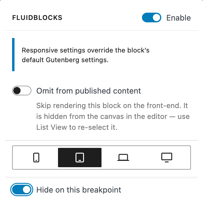
Visibility
Spacing
Padding
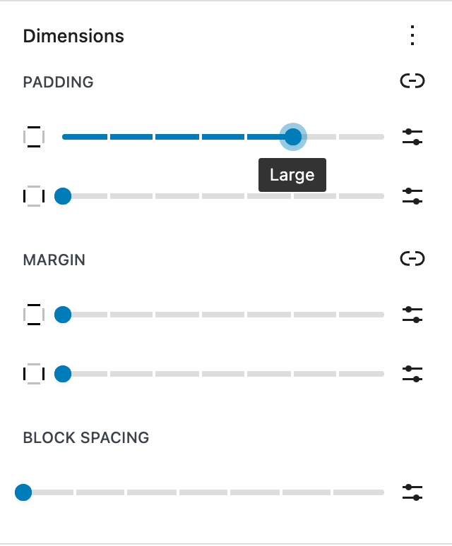
freeSet inner spacing per breakpoint with 4-side control. Tighten padding on mobile, expand on desktop — from the block toolbar.
Margin
freeOuter spacing per breakpoint with 4-side control. Tune vertical rhythm and horizontal offsets across mobile, tablet, desktop, and XL.
Block Spacing (Gap)
freeControl the row-gap and column-gap between child blocks independently, per breakpoint. Tighter spacing on mobile, generous gaps on desktop.
Spacer Height
freeCustom spacer heights per breakpoint. Less space on mobile, more room to breathe on desktop.
Width
freeBlock-level width override per breakpoint, including for columns, images and buttons. Mix unit types (px, %, rem, vw).
Image Height & Aspect Ratio
freeFixed height and aspect ratio for the Image block per breakpoint — square on mobile, 16:9 on desktop. Height crops with object-fit: cover, exactly like core.
Minimum Height
freePer-breakpoint min-height for Group — a full-viewport hero on desktop that collapses to content height on mobile.
Layout
Justification
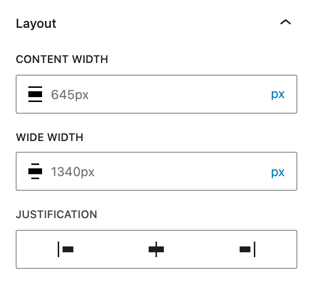
freeControl flex justify-content per breakpoint. Center content on mobile, space-between on desktop.
Vertical Alignment
freeControl cross-axis alignment (align-items) per breakpoint. Top-aligned on mobile, centered on desktop.
Flex Wrap
freeAllow a row to wrap onto multiple lines per breakpoint. A row of buttons wraps on mobile and stays on one line on desktop.
Grid Columns
freeOverride the grid column count per breakpoint. Stack on mobile, 2 columns on tablet, 4 on desktop.
Grid Min. Column Width
pro"As many columns as fit, at least 250px each" — per breakpoint. On its own the grid auto-fills; with Grid Columns the count becomes the per-row maximum, using core's own formula.
Content & Wide Width
proOverride constrained layout sizes per breakpoint. Different content widths for mobile and desktop.
Flex Width
proFit, grow, or fixed main-axis size for any block placed inside a Group Row. Mirrored with Flex Height — values follow the parent layout.
Flex Height
proFit, grow, or fixed main-axis size for any block placed inside a Group Stack. Mirrored with Flex Width.
Grid Column Span
proNumber of grid columns a child block occupies, per breakpoint. Defaults to 1.
Grid Row Span
proNumber of grid rows a child block occupies, per breakpoint. Defaults to 1.
Order
proReorder a block within its flex or grid parent — any integer per breakpoint, including negatives.
Container Queries
plannedStyle blocks based on their container size, not the viewport. Works with theme.json container-name declarations.
Typography
Font Size
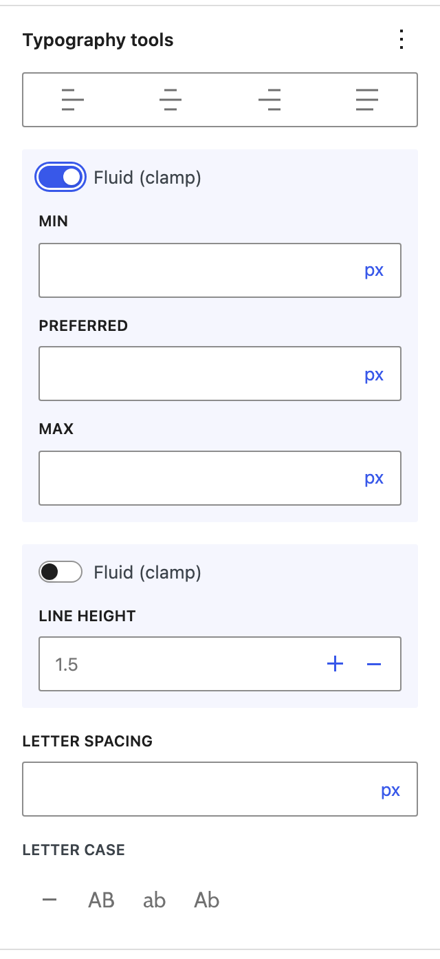
freePer-breakpoint font-size for any block with native typography support — picked from theme presets or custom values.
Line Height
freePer-breakpoint line-height as a unitless number or with explicit units.
Text Alignment
freePer-breakpoint text-align — left, center, right, justify — on every block that has typography support.
Fluid Typography
proclamp(min, vw, max) ranges per breakpoint. Type that scales smoothly between viewport sizes instead of jumping at breakpoints.
Letter-spacing & Text-transform
freePer-breakpoint letter-spacing and text-transform (uppercase, lowercase, capitalize).
Font Family & Weight
plannedPer-breakpoint font-family and font-weight overrides — pull from theme presets or custom stacks.
Color & decoration
Colors
plannedPer-breakpoint text, background and link colors, with hover, focus and active states. Picked from theme palettes or custom values.
Borders
freePer-breakpoint border width, radius, color and style — independently for all four sides.
Shadows
plannedPer-breakpoint box-shadow and text-shadow with multi-layer support.
Backgrounds
plannedPer-breakpoint background image, gradient, position, size and overflow. Swap a portrait image on mobile for a landscape one on desktop without writing CSS.
Position & Z-index
plannedPer-breakpoint position (static, relative, absolute, sticky) with offsets and z-index.
Media
Image srcset
plannedPer-breakpoint srcset overrides for the Image block. Pair with art-direction crops for true responsive imagery.
Background Video
plannedPer-breakpoint background video with poster fallback for the Cover block.
Productivity
Copy & Paste Settings
freeCopy a block's whole responsive setup and paste it onto any other supported block — only the controls the target supports are applied. Works across blocks and documents in the same editor session.
Preset Library
plannedSave a set of responsive values as a named preset and apply it to any compatible block. Build a personal or team library.
Sync Between Blocks
plannedLive-link two or more blocks so a change in one applies to all synced siblings. Break the link to edit independently.
Import / Export
plannedExport per-block responsive settings as JSON, import them on another site. Useful for syncing design systems across multiple sites.
Configuration
Custom Breakpoints
freeOverride Mobile, Tablet, Desktop, and XL pixel ranges to match your project — applied to both editor preview and frontend CSS.
Developer API
freeFilters and hooks to register your own blocks, features, and settings — extend the plugin without forking.
White Label
proRebrand the plugin with a custom name, description, author, and menu label. Ideal for agencies and client sites.
The free tier lands on WordPress.org soon — Pro follows.